Creative Branding & Visual Design
From my perspective as an artist, typography goes beyond selecting fonts;
it's about creating visual harmony and enhancing communication. The choice of typeface, spacing, and arrangement profoundly impacts the viewer's perception and interpretation of the message.
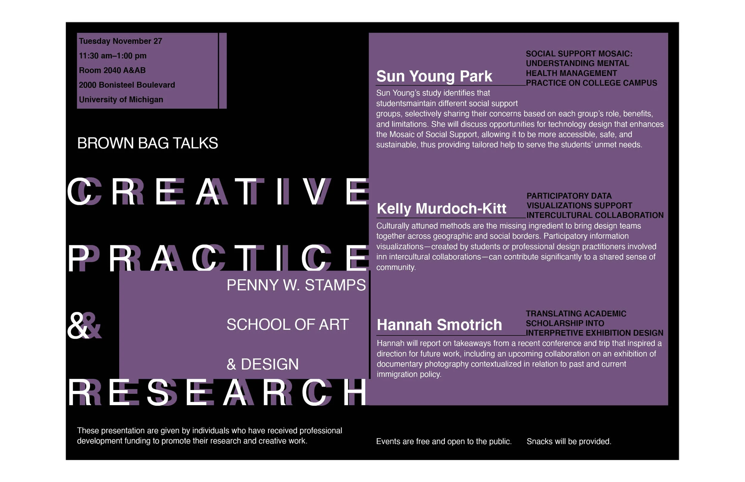
Brown Bag Talks: Typography-Driven Posters
These posters were designed for Brown Bag Talks, a creative practice and research event at the University of Michigan- Stamps School of Art and Design. Focusing entirely on typography, each poster was crafted to capture attention and communicate event details through bold, innovative type treatments. The minimalist, type-centered design approach emphasizes the intersection of creativity and academic research, using layout, scale, and spacing to convey both the intellectual and artistic aspects of the event.
Client
University of Michigan- Brown Bag Talks
Year
11/01/2020


SparkVotes 2020: Energizing Student Voters
As part of SparkVotes, a non-partisan, peer-to-peer creative campaign, this Instagram graphic series was designed to energize voters ahead of the 2020 election. The campaign aimed to untangle confusion and address barriers to voting by providing clear, accessible information about voter rights, and how to navigate the voting process. Through the straightforward messaging, the graphics encouraged informed participation, ensuring that everyone felt empowered to vote.
Client
University of Michigan- SparkVotes Initiative
Year
11/01/2020


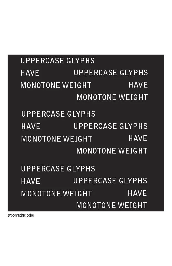
Bell Gothic Typeface: History and Design Exploration
This poster and spread showcase the Bell Gothic typeface, exploring its history, design characteristics, and modern applications. Originally developed for AT&T directories, Bell Gothic is known for its legibility and functionality in high-speed printing. The design emphasizes the typeface’s distinct features, such as its geometric forms and efficient use of space, while visually communicating its role in typographic history. The spread integrates a mix of textual and visual elements to provide a comprehensive overview of Bell Gothic’s impact on modern typography.
Project
Typography assignment
Year
11/01/2020


Typography
adds a layer of meaning and emotion to the work, contributing to the overall narrative. Understanding typography allows me to better control the visual hierarchy, guiding the viewer's eye and emphasizing key elements of my designs. It bridges the gap between visual art and written language, making it an essential tool for effective and compelling communication.
Sustainable Future: Event Graphics for Global Conferences
This series of Instagram graphics was designed to promote key global events, including the UN Ocean Conference, High-Level Political Forum on Sustainable Development, and North American Youth Adaptation Forum. Each graphic effectively communicates important event details—such as time, location, and purpose—while adhering to the themes of sustainability and global cooperation. The designs utilize bold visuals and clear typography to engage and inform diverse audiences about crucial discussions shaping our planet’s future.
Client
UN Peace Boat-US
Year
06/15/2022


Leaf & Brew: Artisan Tea Packaging & Branding Concept
This project showcases the branding and packaging design for Leaf & Brew, a conceptual artisan tea brand focused on natural, calming blends. Each flavor was carefully crafted to evoke relaxation and balance, while the packaging design reflects the brand's commitment to organic ingredients and a soothing aesthetic. The designs include custom patterns, typography, and illustrations that align with the brand’s eco-friendly, wellness-focused identity.
Client
Leaf&Brew
Year
10/01/2024


Other Work:

Re- designed cover for Beloved; 2016

Global Warming; 2017

University of Michigan Boxing Club Poster 2019

Bowl For Kids' Sake; 2019

Next Up; 2019

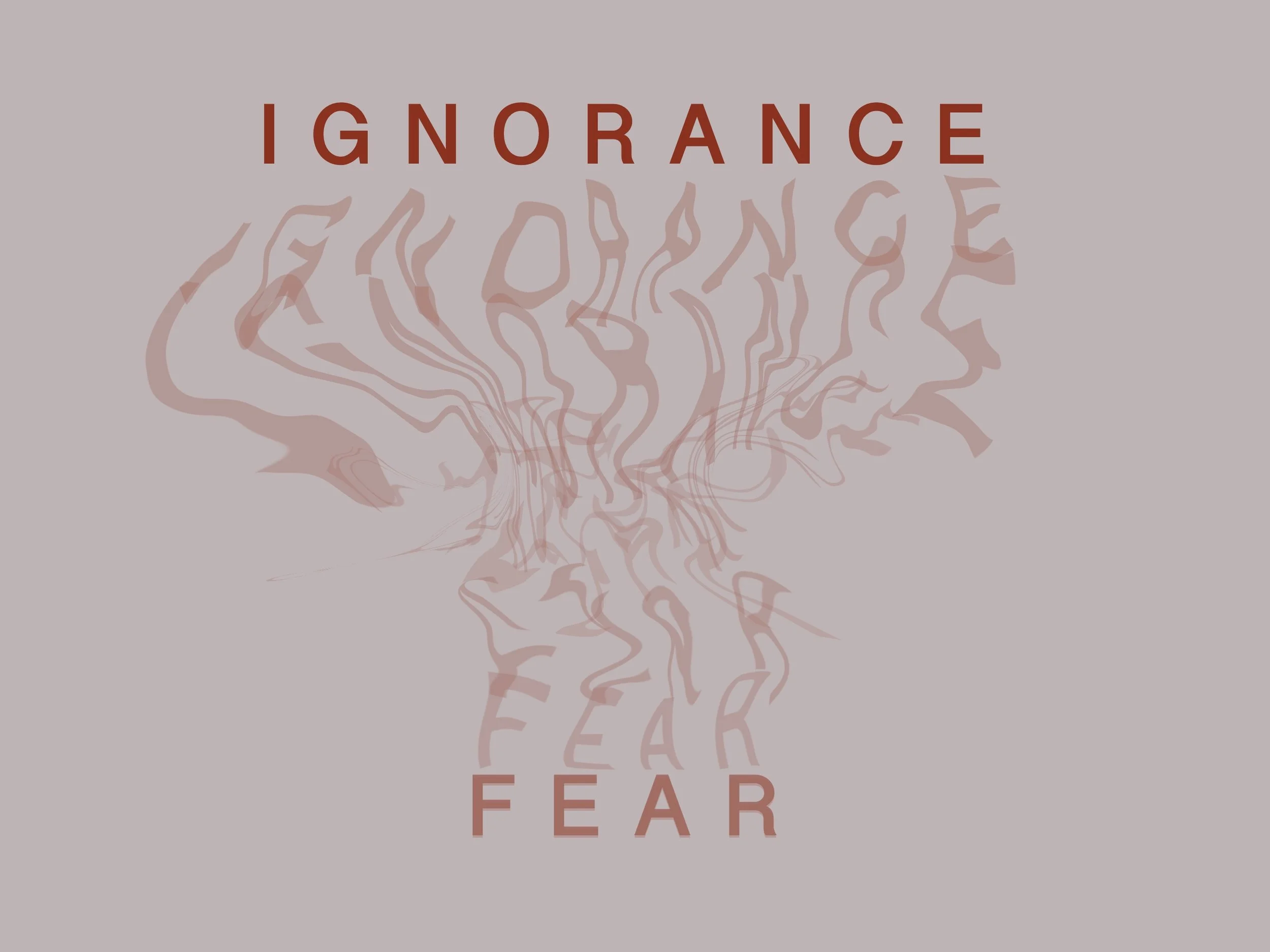
Fear Poster; 2020

Abstract Poster (Adaptive & Authentic); 2020

Abstract Typography A+L; 2020